Dragon Up Game Store Redesign

The case study goal was to redesign the Dragon Up game store to improve user experience.

The brief

  1. Perform a basic heuristic review on the current existing project. Including suggestions to improve conversion, and the purchase experience in general.
  2. A mid-vis mock that shows recommended changes with a few points explaining my process and decisions.

Software Used

Before and After

Here is the comparison of the original and my design of the game store.

Original


My Design


Section 1: Heuristic Review

After taking time to fully explore the entire game, I tried to execute the following tasks for this evaluation:
  • Checking the types of items available for purchase
  • Viewing available deals/offers
  • Searching for free stuff
  • Attempting to make purchases
1: Visibility of System Status:
Having currency displayed on the top bar is important, as it keeps these key game elements always visible to the player. In addition, the game clearly indicates coldowns such as the cards refresh time and free potions claim time. I did however notice that the timers are not consistent, with some being shown in all caps, while others are not. This will be covered in section “4. Consistency and standards” below.

It is also good that the players can see the number of cards they already have and the amount they need without extra clicks in the store. 2: Match between system and the real world:
Choosing the right icons and words is also important to help the players navigate and understand the context easier while keeping the layout simple and clean. Having an icon beside the currency at the top educates the players on what each of them represents. After that, everything else can use the icon instead of text. However, it is important to use familiar icons that players can relate to in the real world, such as a gold coin for the gold currency.

This store uses a lot of familiar terms and icons to help players quickly understand the context. For example, the shopping cart representing the store relating to shopping in an actual store. Or a showing a gold coin with the TV representing that they can earn coins by watching an ad. This game makes good use of the icons and words relating it between the game and the real world.

3: User control and freedom:
It is important that users can cancel any actions before they purchase. The limited number of steps required to complete a purchase is good. When viewing ads for free items or rewards, some ads allow users to cancel out, forfeiting the reward, while others force them to continue watching the ad to completion no matter what.

4: Consistency and standards:
Consistency of the way items and their costs are displayed:
The design of the Cards section is different than the other sections. For example, the potion cost for a card is not bound in a frame like the cost of chests are. I would recommend making all these consistent (as shown in my mock-up).

Consistency of timers:
The timer shown in the Cards section uses all caps with no spaces, and includes seconds (eg: 2H59M30S) where the one for free potions is displayed in all lower case, with spaces between the hours and minutes with no seconds shown (eg: 2h 59m). Having it all in uppercase improves the readability and keeps consistent with the way text is shown in-game.

Consistency of font sizes:
Font sizes are also not consistent between the chests and the other items.

5: Error prevention:
I think the error prevention is good in this store. It displays a confirmation pop-up before completing a transaction, helping to prevent accidental purchases.

By placing the settings button in the top left of the screen instead of the top right, players are less likely to unintentionally click it with their regular interactions in the store.

6: Recognition rather than recall:
Overall, the visual cues in the store are good, using icons instead of words for the types of currency required. The currencies also use different colours, further helping to differentiate between each type of currency.

7: Flexibility and efficiency of use:
The store is easy to use for both beginners or experienced players. It has the least amount of steps that are required for purchases and each section is clearly laid out. There are also shortcuts where players can click and it scrolls into that section. For example, more experienced players can purchase more gems by clicking on the + icon beside the gems currency on the top and they will be brought to the gems section in the store.

8: Aesthetic and minimalist design:
Overall this store is keeping it minimal and aesthetically pleasing. The icons representing the cost of items is shown in most cases, keeping displayed item information at a minimum. It is important to be selective on which information is shown on the screen so the interface can be clear of unnecessary elements and clutter. Clicking the item will show additional details before purchase. The current game design has done well on this.

9: Help users recognize, diagnose, and recover from errors:
Effective error messages are used to communicate the error. This helps the player by reducing the amount of work they need to try figuring out what’s wrong and educate them along the way. Purchase error messages are used when there are not enough funds. In this case, I will suggest renaming the pop-up to “OOPS!” or other friendly messages and adding the amount needed for that the players to make the purchase.

Greyed out boxes help the players to realize that they can’t click to claim the free potions. The additional timer helps the player know when it is going to reset. When it is time, the box turns to green with the word “CLAIM!” on it. This works well in the store because other areas of the game uses the same greyed out box for tasks not completed.

10: Help and documentation:
The help button is in the settings menu which directs players who have questions or need help to send an email to the company. As this is a simple game with limited items and purchase options, this support method should be enough.

Section 2: Redesign Documentation

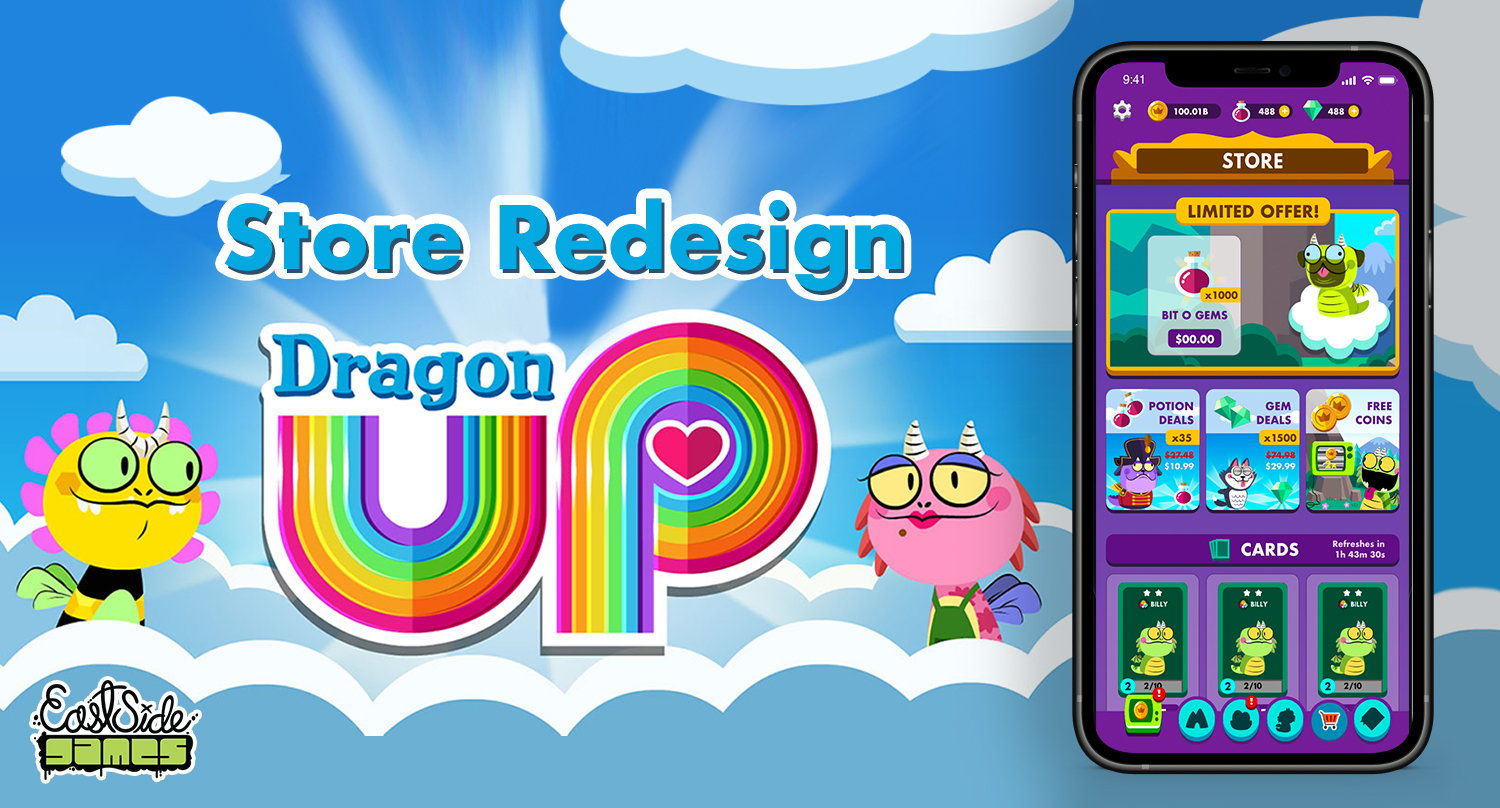
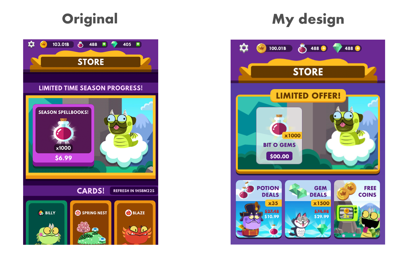
Diving into the redesign, there are a few major things I really like and are important to keep from the current design:

  • The featured limited offer that is displayed at the top.
  • The order of sections being displayed.
  • The free potions at the bottom so the players will need to visit the store when they tap to get free potions, exposing them to the items available for purchase.
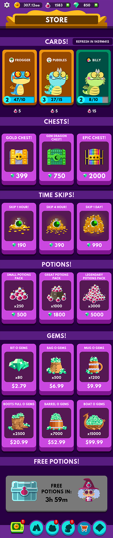
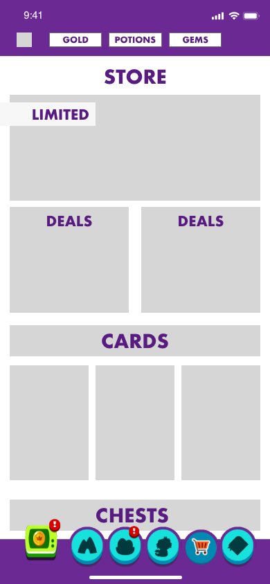
I did a basic wireframe sketch before going into making the mock-up (Image 1: Wireframe). I kept the bottom menu as it is as this is a top-level element, visible throughout the whole game, not only the store.

In the wireframe, I kept the limited feature deal on the top while adding additional spots for other deals. I originally thought about having it scroll horizontally while only showing one at a time. However, I discarded the idea because this game store doesn’t contain a large amount of items, so it would be nice to see them all when players get into the store.

I decided to use Adobe XD so I can test it while I was designing it. As I was designing the mock-up, I was always changing things around. With limited time, constant prototyping is important, testing out changes while actively designing them.

I wanted to find the font that is closest to the current game font, which I believe to be Futura Bold. Currently, most of the text is shown in all caps, with only a few minor exceptions.

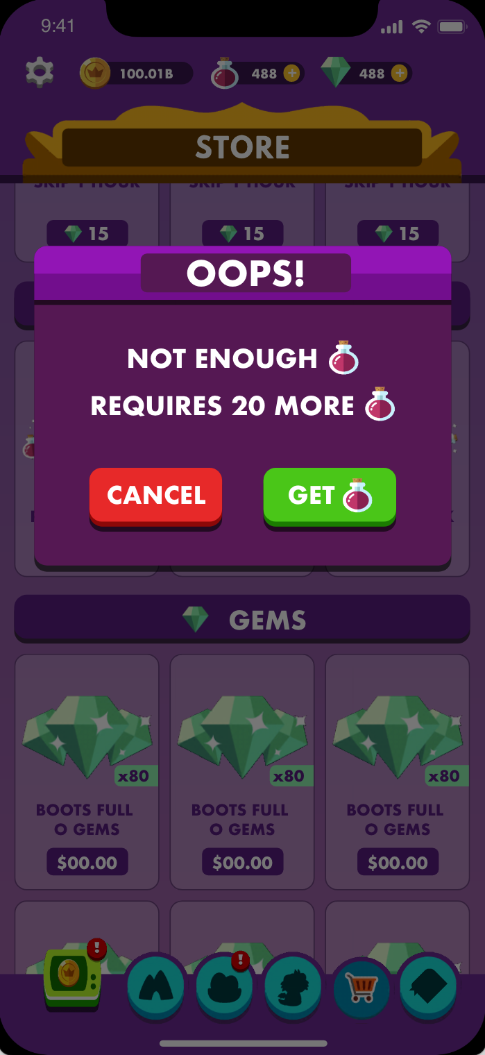
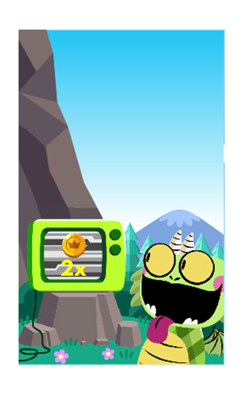
To speed up the wireframe and mockup process, most of the images I used were screenshots taken and cropped from the game. For images that needed to be larger, I extended their background using Illustrator. Most of the smaller elements are built in Adobe XD.

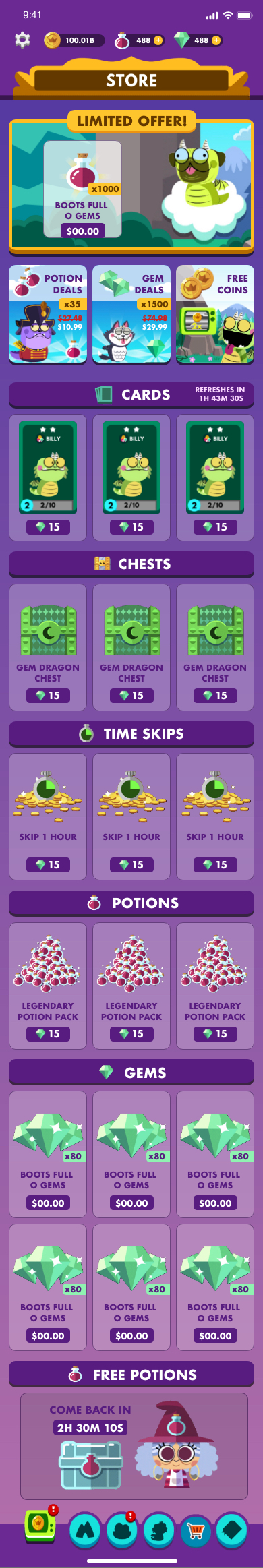
The recommended changes in my mock-up are the following.

Featured deals on top in a larger grid:

My redesign keeps the featured limited offer at the top of the store. While the wireframe tested two additional offer slots, for the actual design I changed this to three smaller ones showing other deals that I’ve seen throughout the game. It is easier for the players to see them in the store all in one place.

I’ve also added a few visual elements to make the banner stand out more.

  • A featured “Limited Offer” banner
  • 3 buttons under features to highlight additional offers
    • Watch an ad to receive 2x coins (it will open options to get more coins)
    • Potion and Gem Deals

Icons for section headers:

Icons were added to each section’s header to make it stand out more than if it were just plain text. Viewers are drawn more to icons than text.

Unified timer:

As mentioned previously, there is an inconsistent format to the timers. I changed them to keep all the timers in a consistent format (2H 30M 10S).

Text display:

Whenever possible, font sizes for similar components should also be similar. (eg: all item names should be visually identical in size).

Item display:

Currently, each item shows the name first, followed by the image, and then the cost. I updated this to be image first, name second, and then cost. I chose to change this to better highlight the item artwork, which is more attractive and eye-catching than the other elements.

Colour changes:

Having a lighter colour background helps to create a stronger contrast between the items and the background, and highlights the items. There are a lot also a lot of different and darker colour elements in the store, therefore, using a lighter colour better helps to focus on these elements. The purple gradient colours were picked from one of the loading screens in the game.

For the majority of the components, I stuck with the game’s existing colour palette with the exception of the item background being white with a little bit of transparency.

Free potions section:

I decided to redesign the button so that the timer shows first. I also changed the wording from “FREE POTIONS IN: (TIME)” to “COME BACK IN (TIME)” because it is an actionable item, the wording is more inviting.

Error message: There is an error message when a player tries to purchase something but doesn’t have enough resources. I suggest renaming the pop-up from “PURCHASE ERROR” to “OOPS!”, making it more friendly to go with the game theme.

Also adding the amount needed for that the players to make the purchase in the pop-up box instead of just saying not enough currency. (eg: Not enough Gems! Requires 20 more gems). After that, add a button that goes to the gems section.

Created Assets

Mockup Scroll Through

Want To Get In Touch?

Drop me a line anytime at the email below and I'll get back to you as soon as I can!