Have You Eaten Yet?

An iPad app for the Museum of Vancouver's 2020 "A Seat at the Table" Exhibition.

About

Presented by The Museum of Vancouver (MOW) and the University of British Columbia (UBC), A Seat at the Table: Chinese Immigration and British Columbia was an interactive exhibition exploring the historical and contemporary stories of Chinese Canadians in British Columbia and their struggles for belonging.

The Museum of Vancouver Exhibition Page

My Roles

UI/UX and Graphic Designer

  • Investigation and evaluation of various UI/UX solutions for displaying data in our application in a method familiar to an audience with a wide range of technical abilities.
  • Rapid prototyping of user interfaces, validated using paper prototyping, digital mockups, and physical and digital user tests.
  • Facilitating the design process from end-to-end, including user experience design (information architecture, flow-charts, and wireframes), creating and managing a live design asset library, as well as elaborating on low to high fidelity prototypes.

Software Used

Our Goal

The objective of this project is to create an interactive experience for visitors to the Museum of Vancouver exhibit showcasing the different Chinese dialects in use throughout China today. Through an embedded hardware exhibition paired with our bespoke application we bring attention to the 34 different Chinese Dialects through the common phrase “Have You Eaten Yet?” This phrase was selected as it’s a common phrase in Chinese, similar to the English phrase “How are you?”

Challenges

  1. Attention span: Showcase the 34 unique regional dialects in a meaningful and engaging way with the user as they explore our application in an environment where interaction time may be limited.
  2. Balanced Visual and Audio Elements: While audio is key to showcasing linguistic diversity, it’s not enough to create a distinct association between the content spoken and the different Chinese-speaking regions. Visuals would need to be carefully designed to complement the audio, enhancing the key takeaways of the experience.
  3. Unified and Consistent:Maintaining consistency and providing a unified experience, keeping within the design guidelines provided by the Museum of Vancouver while providing a unique and memorable experience.

Project Location Within the Exhibition

Our project was first loaded onto a number of iPads which were then placed on three “dimsum-style” tables towards the end of the larger MOV exhibition.

Key User Takeaways

During early discussion with our client, it was clear that this was not intended to function as a language learning app. The primary goals were to provide users with:
  1. An appreciation and understanding of the culture and linguistic diversity.
  2. An understanding of the different regions and where the different dialects originate from.
  3. “Edutainment” through a combination of engaging visuals and meaningful audio.

Solution: Visualize with Food


Our objective was to create a meaningful and appealing application that welcomes the wide range of visitors who visit the Museum of Vancouver, making the Chinese dialects presented friendly to both users familiar or unfamiliar with the language.

Our team brainstormed a number of different ideas for our design, ultimately opting to use food visuals to create a strong visual connection with the dishes that play a key role in Chinese culture.

Furthering the food theme, our application would then be presented using iPads placed on “dimsum-style” tables in a part of the exhibition titled “A Seat at the Table.”

The incredible diversity in Chinese cuisine allowed us to showcase a number of unique regional dishes alongside the appropriate regional dialects providing users with a larger view of that region as well as Chinese culture as a whole.

Project Demo

The Process

Research

One of our key priorities was to ensure accuracy and authenticity of our content, avoiding misconceptions and misinformation with regards to both the Chinese dialect and Chinese food as seen in Western Culture.

An example of this would be “Hunanese” General Tso’s chicken, which is in reality an American creation with a touch of Chinese flavours.

To ensure the utmost accuracy with the information we would then present to users, we completed the following:
  1. In-depth research into each selected regional dish through a number of reputable sources from both Western and Eastern media, ensuring it was well known in that region.
  2. Conducting user research and consulting with multiple articles from the Chinese online community to cross-reference for accuracy.
  3. Communicating with the Museum of Vancouver’s internal teams to finalize an appropriate list of dishes and audio files in accordance with the goals of the larger exhibit.

Initial Designs

The design of our application would need to be easy and intuitive, with simple navigation that feels natural to the user so as not to distract from the visual and auditory experience.

When visitors approach the table the iPads green the user with an idle screen. The objective of this screen is to:
  1. Highlight the name of our application.
  2. Contextualize the meaning behind the selected phrase “Have you eaten yet?”
  3. Provide instructions on how to navigate the application and prompt users to put on headphones to improve their experience.
When tapping anywhere on the idle screen, users are then loaded in to the map screen featuring:
  1. A complete map of China, including autonomous regions such as Taiwan, Macau, and Hong Kong, each noted by an animated location pin.
  2. A scrollable list of all available regions.
  3. An information button which would take the user back to the instructions found on the idle screen.
Users can select a region by tapping it on the map, or selecting it in the list. Doing so presents the user with the following:
  1. A highlighted map view showing the location of the region as part of the larger picture.
  2. An automatically played audio recording of that region’s dialect with a replay button for the users to listen again.
  3. An image of that region’s famous dish alongside the dish name, which slides in after the audio finishes playing for the first time.

Personas

To better understand our potential users, various user personas were created based on the current visitors seen by the Museum of Vancouver.

User Journey

User Flow

User charts, wireframes, and storyboards were created to better communicate the details of our application design to our technical team, helping to reduce development time.

Our application made use of simple design with only two main points of interaction, enabling users to quickly and easily explore the map and further details of the regional dish and dialect.

If left idle for a period of 30 seconds, the application would revert back to the main idle screen and be ready for the next user.


Rapid Prototyping and User Testing

Considering the tight timeline of this project, a weekly routine of rapid prototyping was essential for understanding and improving the user experience. A series of paper prototype user tests were first conducted, allowing us to adapt our initial user flow through quick iterations based on our feedback.


Our initial design prototype was then selected, and a digital experience was created with the art assets we had on hand. Using this, we continued our routine user tests receiving valuable insights and helping to shape our final design.

One change that came out of this process was to add a short description of the food dish, as the tests found that users wanted to know more about the image shown on screen.

This led to additional content being created, with unique descriptions for each dish, encouraging the user to continue exploring the map to learn more.

Visual Development

To ensure our project kept consistent with others in the exhibition, we first focused on the common colours of red and yellow for our art assets. (Seen in the image on the left below) While these colours proved strong and bold, they also proved to overpower the other visual elements shown on-screen.

Our final concept replaced these strong colours with ones that were more delicate and easy on the eye, while maintaining the use of red as smaller accents. (Seen in the image on the right below) This helped to draw focus to the correct areas, while ensuring cohesion with the rest of the exhibition.

Final Deliverable

Through our ongoing prototyping, testing, and iterations, the final version was created:

In-App Assets

These are a small section of the numerous icons, buttons, and illustrations featured in the application.

Feedback from our Client

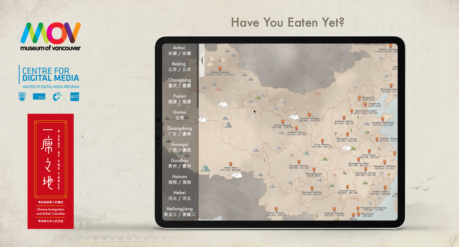
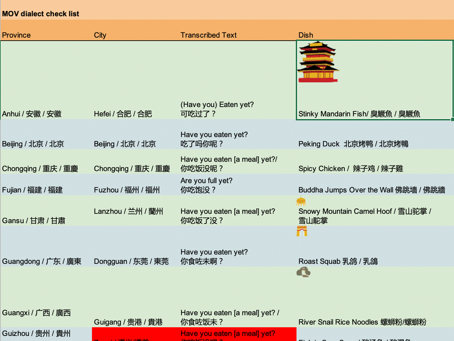
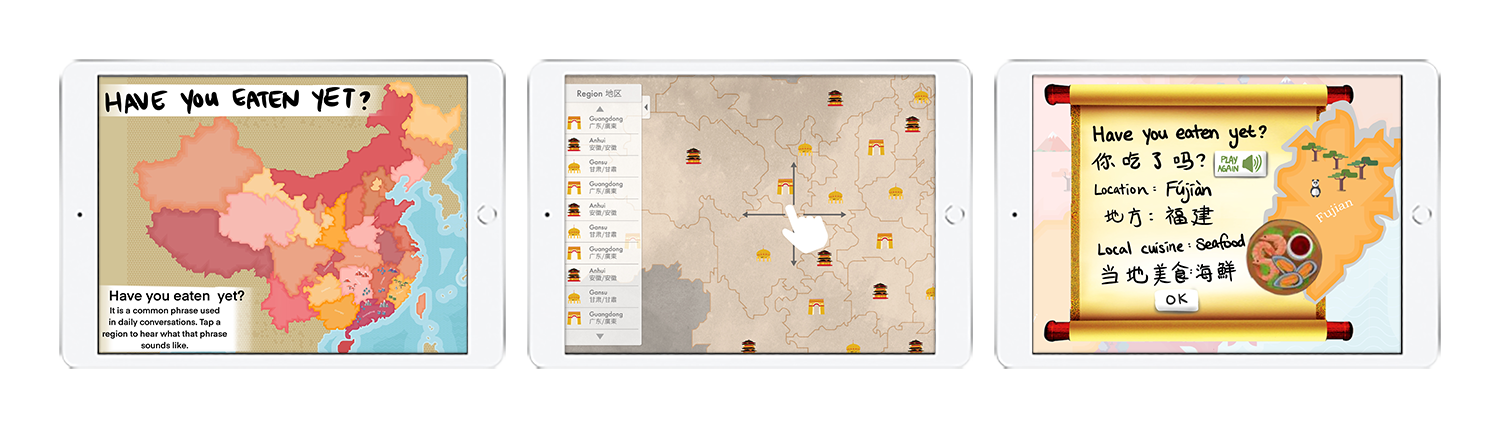
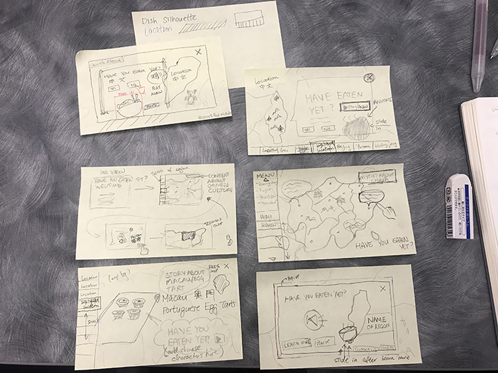
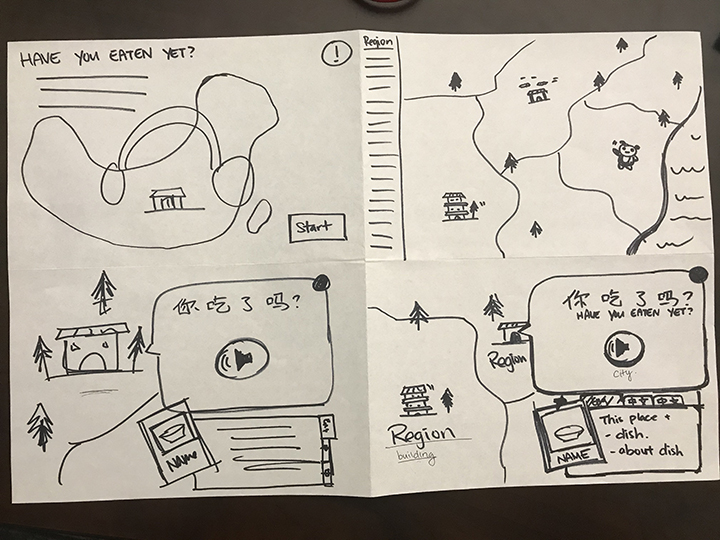
“We have been SO impressed by the assiduity, flexibility, and high caliber of the MDM student cohort that collaborated with us on developing a series of digital products for the exhibition A Seat at the Table: Chinese Immigration and British Columbia. Their animated maps (…) help us address the key themes of belongings, racism, and resilience in novel and meaningful ways. Their work is contributing significantly to the interpretive program, and as a result it will help visitors gain a greater appreciation of the contributions that Chinese migrants and their descendants have made to the province.”
Viviane Gosselin
Director of Collections and Exhibitions

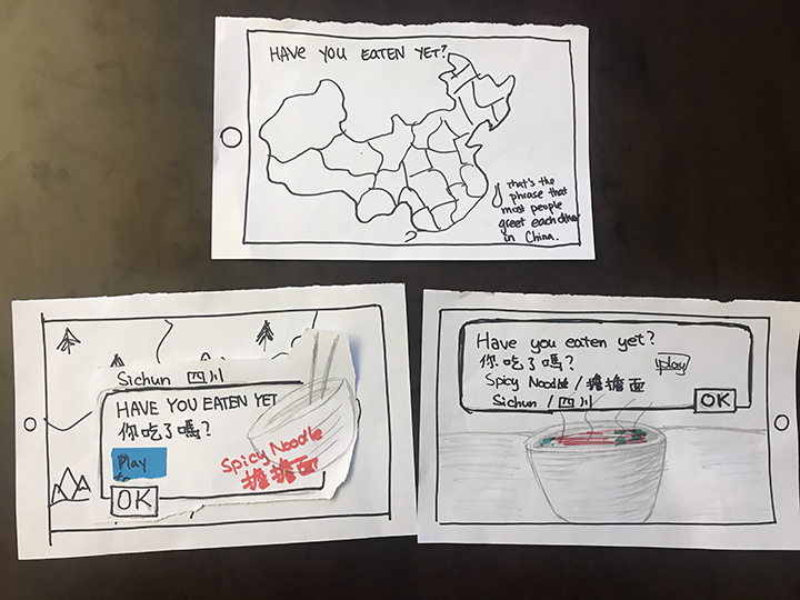
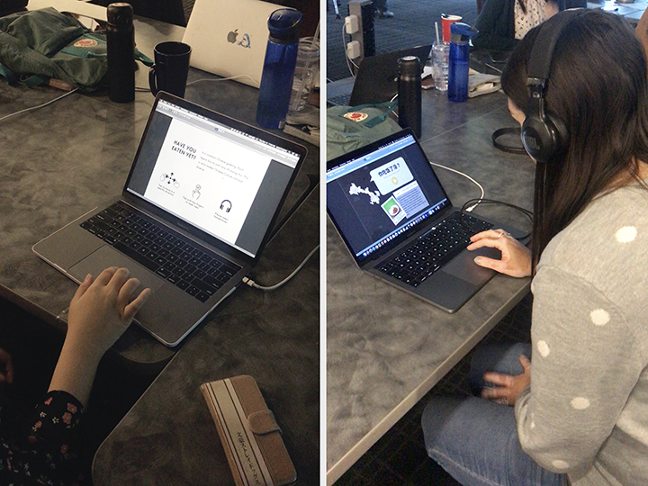
“The added challenge to this year’s projects was the requirement to include trilingual content. We were very impressed by the ingenuity and passion the student teams demonstrated through their work — we were especially impressed by their ability to bring history alive through the many creative solutions (and language skills) they brought to the table.”
Denise Fong
Co-Curator, A Seat at the Table exhibition

Future Growth

With the success of our project with featuring the 34 Chinese dialects and their regional dishes, further consideration could then be given to potential expansion through exploration of foods and dialects of other regions and countries.

Want To Get In Touch?

Drop me a line anytime at the email below and I'll get back to you as soon as I can!